
from tkinter import *#引入tkinter所有功能
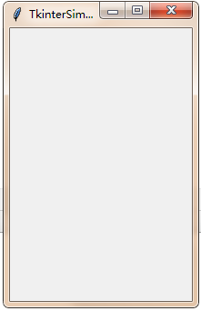
root = Tk()#创建窗口主体
root.title("TkinterSimple")#主体窗口的名称
root.geometry("200x300") # 设置窗口大小 注意:是x 不是*
root.resizable(width=True, height=False) # 设置窗口是否可以变化长/宽,False不可变,True可变,默认为True
root.mainloop()#窗口事件循环
| root.title(‘标题名’) | 修改框体的名字,也可在创建时使用className参数来命名; |
| root.resizable(0,0) | 框体大小可调性,分别表示x,y方向的可变性;1表示可变,0表示不可变; |
| root.geometry(‘200×300’) | 指定主框体大小; |
| root.quit() | 退出;(配合响应事件使用) |
| root.update() | 刷新页面; |
| root.mainloop() | 进入消息循环(必需组件) |
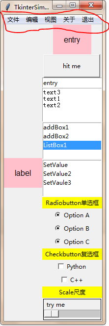
2.Lable标签
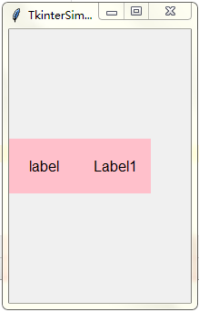
#label常规引用
l = Label(root, text="label", bg="pink", font=("Arial",12), width=8, height=3)
l.pack(side=LEFT) # 这里的side可以赋值为LEFT RTGHT TOP BOTTOM
#label标签动态显示,变量引入
var = StringVar()
var.set('Label1')
l = Label(root, textvariable = var, bg="pink", font=("Arial",12), width=8, height=3)#标签动态显示
l.pack(side=LEFT)
| Anchor | 标签中文本的位置; |
| borderwidth(bd) | 边框宽度; |
| bitmap | 标签中的位图; |
| image | 标签中的图片; |
| text | 标签中的文本,可以使用’\n’表示换行 |
| background(bg)foreground(fg) | 背景色;前景色; |
| width 、height | 标签宽度;标签高度; |
| font | 字体; |
| justify | 多行文本的对齐方式; |
| textvariable | 显示文本自动更新,与StringVar等配合着用 |
3.Button按钮
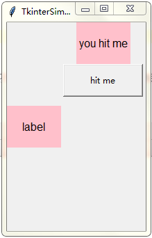
#Button按钮
on_hit = False # 默认初始状态为 False
def hit_me():#按钮调用动作,函数
    global on_hit
    if on_hit == False: # 从 False 状态变成 True 状态
        on_hit = True
        var.set('you hit me') # 设置标签的文字为 'you hit me'
    else: # 从 True 状态变成 False 状态
        on_hit = False
        var.set('') # 设置 文字为空
b = Button(root, text='hit me',width=15, height=2, command=hit_me)#这里用hit_me,不要用hit_me(),否则程序直接执行它,而且不会重复调用
b.pack() # 按钮位置
| anchor: | 指定按钮上文本的位置; |
| background(bg) | 指定按钮的背景色; |
| bitmap: | 指定按钮上显示的位图; |
| borderwidth(bd) | 指定按钮边框的宽度; |
| command: | 指定按钮消息的回调函数; |
| cursor: | 指定鼠标移动到按钮上的指针样式; |
| font: | 指定按钮上文本的字体; |
| foreground(fg) | 指定按钮的前景色; |
| height: | 指定按钮的高度; |
| image: | 指定按钮上显示的图片; |
| state: | 指定按钮的状态(disabled); |
| text: | 指定按钮上显示的文本; |
| width: | 指定按钮的宽度 |
| padx | 设置文本与按钮边框x的距离,还有pady; |
| activeforeground | 按下时前景色 |
| textvariable | 可变文本,与StringVar等配合着用 |
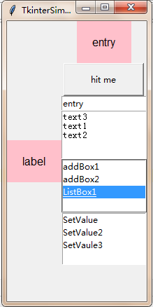
4.Entry单行文本框
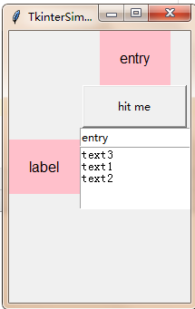
#Entry单行文本框
var_e = Variable()
e = Entry(root, textvariable=var_e)
var_e.set("entry") # 设置文本框中的值
e.pack() # 这里的side可以赋值为LEFT RTGHT TOP BOTTOM
#Entry值得获取
var_e.set(e.get())#把值给了顶端标签

| background(bg) | 文本框背景色 |
| foreground(fg) | 前景色 |
| selectbackground | 选定文本背景色 |
| selectforeground | 选定文本前景色 |
| borderwidth(bd) | 文本框边框宽度 |
| font | 字体 |
| show | 文本框显示的字符,若为*,表示文本框为密码框 |
| state | 状态 |
| width | 文本框宽度 |
| textvariable | 可变文本,与StringVar等配合着用 |
5.Text多行文本框
#Text多行文本框
t = Text(root, width=50, height=5) #50的意思是30个平均字符的宽度,height设置为两行
t.pack()
t.insert('1.0',"text1\n") # 插入
t.insert(END,"text2\n") # END:这个Textbuffer的最后一个字符
t.insert('1.0',"text3\n")
#t.delete('1.0','2.0') # 删除
| background(bg) | 文本框背景色 |
| foreground(fg) | 前景色 |
| selectbackground | 选定文本背景色 |
| selectforeground | 选定文本前景色 |
| borderwidth(bd) | 文本框边框宽度 |
| font | 字体 |
| show | 文本框显示的字符,若为*,表示文本框为密码框 |
| state | 状态 |
| width | 文本框宽度 |
| textvariable | 可变文本,与StringVar等配合着用 |
6.ListBox列表
#Listbox 列表
listbox = Listbox(root,selectmode = EXTENDED,height=4)
listbox.insert(END,'ListBox1')
listbox.insert(END,'ListBox2')
listbox.insert(END,'ListBox3')
listbox.pack()
#listbox = Listbox(root, selectmode = MULTIPLE),多选
#listbox = Listbox(root, selectmode = BROWSE),通过鼠标的移动选择
#listbox = Listbox(root, selectmode = EXTENDED),shift和ctrl配合使用
#新增和删除
#追加item
listbox.insert(0,"addBox1","addBox2")
#删除item
listbox.delete(3,4)
#删除全部(0,END)
#默认选中和取消
#选中
listbox.select_set(0,2)
#取消选中
listbox.select_clear(0,1)
#获取索引以及值
#返回制定索引的项值
print(listbox.get(1))

#返回多个项值,返回元组
print(listbox.get(0,2))

#返回当前选中项的索引
print(listbox.curselection())
#判断状态
#判断是否选中
print(listbox.select_includes(0))
print(listbox.select_includes(2))

def printList(event):
    print(listbox.get(listbox.curselection()))
#双击
listbox.bind('<Double-Button-1>', printList)
#更换每项的值
v1 = StringVar()
listbox1 = Listbox(root, listvariable=v1,height=4).pack()

v1.set(('SetValue','SetValue2','SetVaule3'))
|
master |
代表了父窗口 |
|
bg |
背景色,如bg=”red”, bg=”#FF56EF” |
|
fg |
前景色,如fg=”red”, fg=”#FF56EF” |
|
height |
设置显示高度、如果未设置此项,其大小以适应内容标签 |
|
relief |
指定外观装饰边界附近的标签,默认是平的,可以设置的参数:flat、groove、raised、ridge、solid、sunken |
|
width |
设置显示宽度,如果未设置此项,其大小以适应内容标签 |
|
state |
设置组件状态;正常(normal),激活(active),禁用(disabled) |
|
bd |
设置Button的边框大小;bd(bordwidth)缺省为1或2个像素 |
|
selectmode |
选择模式,MULTIPLE:多选 BROWSE:通过鼠标的移动选择 EXTENDED:shift和ctrl配合使用 |
|
listvariable |
设置listvariable属性 |
7.Radiobutton单选框
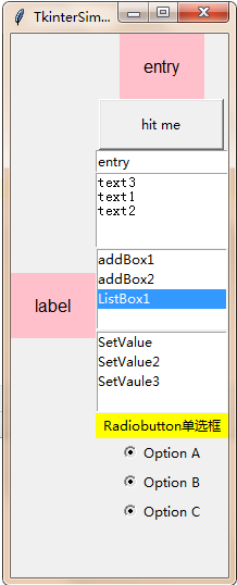
#Radiobutton单选框
var = StringVar()
l = Label(root, bg='yellow', width=20, text='Radiobutton单选框')
l.pack()
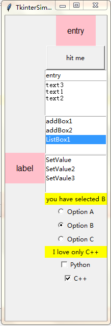
def print_selection():
l.config(text='you have selected ' + var.get())
r1 =Radiobutton(root, text='Option A',
variable=var, state='normal',value='A',
command=print_selection)
r1.pack()
r2 = Radiobutton(root, text='Option B',
variable=var, value='B',
command=print_selection)
r2.pack()
r3 = Radiobutton(root, text='Option C',
variable=var, value='C',
command=print_selection)
r3.pack()
|
text |
显示文本内容 |
|
command |
指定Radiobutton的事件处理函数 |
|
image |
可以使用gif图像,图像的加载方法img = PhotoImage(root,file = filepath) |
|
bitmap |
指定位图,如bitmap= BitmapImage(file = filepath) |
|
variable |
控制变量,跟踪Radiobutton的状态,On(1),Off(0) |
|
master |
代表了父窗口 |
|
bg |
背景色,如bg=”red”, bg=”#FF56EF” |
|
fg |
前景色,如fg=”red”, fg=”#FF56EF” |
|
font |
字体及大小,如font=(“Arial”, 8),font=(“Helvetica 16 bold italic”) |
|
height |
设置显示高度、如果未设置此项,其大小以适应内容标签 |
|
relief |
指定外观装饰边界附近的标签,默认是平的,可以设置的参数:flat、groove、raised、ridge、solid、sunken |
|
width |
设置显示宽度,如果未设置此项,其大小以适应内容标签 |
|
wraplength |
将此选项设置为所需的数量限制每行的字符,数默认为0 |
|
state |
设置组件状态;正常(normal),激活(active),禁用(disabled) |
|
selectcolor |
设置选中区的颜色 |
|
selectimage |
设置选中区的图像,选中时会出现 |
|
underline |
With the default value of -1, none of the characters of the text label are underlined. Set this option to the inde |
|
bd |
设置Radiobutton的边框大小;bd(bordwidth)缺省为1或2个像素 |
|
textvariable |
设置Radiobutton的textvariable属性,文本内容变量 |
|
padx |
标签水平方向的边距, 默认为1像素 |
|
pady |
标签竖直方向的边距, 默认为1像素. |
|
justify |
标签文字的对齐方向, 可选值为 RIGHT, CENTER, LEFT, 默认为 Center |
8.Checkbutton复选框
#Checkbutton复选框
lc = Label(root, bg='yellow', width=20, text='Checkbutton复选框')
lc.pack()
var1 = IntVar()
var2 = IntVar()

def print_selection_c():
    if (var1.get() == 1) & (var2.get() == 0):
        lc.config(text='I love only Python ')
    elif (var1.get() == 0) & (var2.get() == 1):
        lc.config(text='I love only C++')
    elif (var1.get() == 0) & (var2.get() == 0):
        lc.config(text='I do not love either')
    else:
        lc.config(text='I love both')

c1 = Checkbutton(root, text='python', variable=var1, onvalue=1, offvalue=0,
command=print_selection_c)
c2 = Checkbutton(root, text='C++', variable=var2, onvalue=1, offvalue=0,
command=print_selection_c)
c1.pack()
c2.pack()
|
text |
显示文本内容 |
|
command |
指定Checkbutton的事件处理函数 |
|
onvalue |
指定Checkbutton处于On状态时的值,如,onvalue=“valueX” |
|
offvalue |
指定Checkbutton处于Off状态时的值 |
|
image |
可以使用gif图像,图像的加载方法img = PhotoImage(root,file = filepath) |
|
bitmap |
指定位图,如bitmap= BitmapImage(file = filepath) |
|
variable |
控制变量,跟踪Checkbutton的状态,On(1),Off(0) |
|
master |
代表了父窗口 |
|
bg |
背景色,如bg=”red”, bg=”#FF56EF” |
|
fg |
前景色,如fg=”red”, fg=”#FF56EF” |
|
font |
字体及大小,如font=(“Arial”, 8),font=(“Helvetica 16 bold italic”) |
|
height |
设置显示高度、如果未设置此项,其大小以适应内容标签 |
|
relief |
指定外观装饰边界附近的标签,默认是平的,可以设置的参数:flat、groove、raised、ridge、solid、sunken |
|
width |
设置显示宽度,如果未设置此项,其大小以适应内容标签 |
|
wraplength |
将此选项设置为所需的数量限制每行的字符,数默认为0 |
|
state |
设置组件状态;正常(normal),激活(active),禁用(disabled) |
|
selectcolor |
设置选中区的颜色 |
|
selectimage |
设置选中区的图像,选中时会出现 |
|
underline |
With the default value of -1, none of the characters of the text label are underlined. Set this option to the inde |
|
bd |
设置Checkbutton的边框大小;bd(bordwidth)缺省为1或2个像素 |
|
textvariable |
设置Checkbutton的textvariable属性,文本内容变量 |
|
padx |
标签水平方向的边距, 默认为1像素 |
|
pady |
标签竖直方向的边距, 默认为1像素. |
|
justify |
标签文字的对齐方向, 可选值为 RIGHT, CENTER, LEFT, 默认为 Center |
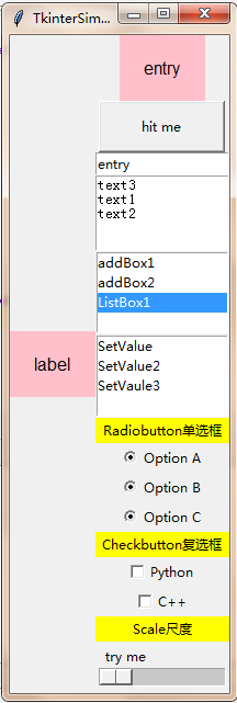
9.Scale尺度
#Scale尺度
ls = Label(root, bg='yellow', width=20, text='Scale尺度')
ls.pack()

def print_selection_s(v):
    ls.config(text='the value ' + v)

s = Scale(root, label='try me', from_=1, to=100, orient=HORIZONTAL,
length=200, showvalue=0, tickinterval=2, resolution=1, command=print_selection_s)
s.pack()
| activebackground | 鼠标悬停在滑块上时的滑块颜色 |
| bg or background | 背景色 |
| bd or borderwidth | 边框 |
| command | 每次移动滑块时调用的过程 |
| cursor | 鼠标样式 |
| digits | 数值位数 |
| font | 字体类型 |
| fg or foreground | 前景色 |
| from_ | 尺度范围的起始数值 |
| highlightbackground | 当刻度没有焦点时,焦点 的颜色会突出显示 |
| highlightcolor | 当具有焦点时,焦点 的颜色会突出显示 |
| highlightthickness | 厚度突出显示。默认值为1.设置highlightthickness=0为禁止显示焦点突出显示 |
| label | 显示标签,如果刻度为水平,则标签显示在左上角;如果是垂直,则标签显示在右上角。默认为无标签。 |
| length | 如果比例为水平,则为x维,如果为 垂直,则为y维。默认值为100像素 |
| orient | orient=tk.HORIZONTAL水平,orient=tk.VERTICAL垂直 |
| relief | 标尺样式,relief=tk.FLAT, 和背景融合, relief=tk.SOLID 标尺黑色边框突出显示 |
| repeatdelay | This option controls how long button 1 has to be held down in the trough before the slider starts moving in that direction repeatedly. Default isrepeatdelay=300, and the units are milliseconds. |
| repeatinterval | This option controls how often the slider jumps once button 1 has been held down in the trough for at least repeatdelay milliseconds. For example, repeatinterval=100 would jump the slider every 100 milliseconds. |
| resolution | 步距值,最小变动单位值 |
| showvalue | 标尺上显示数值 |
| sliderlength | Normally the slider is 30 pixels along the length of the scale. You can change that length by setting the sliderlength option to your desired length. |
| sliderrelief | By default, the slider is displayed with a tk.RAISED relief style. For other relief styles. |
| state | Normally, scale widgets respond to mouse events, and when they have the focus, also keyboard events. Set state=tk.DISABLED to make the widget unresponsive. |
| takefocus | Normally, the focus will cycle through scale widgets. Set this option to 0 if you don’t want this behavior. |
| tickinterval | Normally, no “ticks” are displayed along the scale. To display periodic scale values, set this option to a number, and ticks will be displayed on multiples of that value. For example, if from_=0.0, to=1.0, and tickinterval=0.25, labels will be displayed along the scale at values 0.0, 0.25, 0.50, 0.75, and 1.00. These labels appear below the scale if horizontal, to its left if vertical. Default is 0, which suppresses display of ticks. |
| to | 尺度范围的终止数值 |
| troughcolor | 槽位颜色 |
| variable | 尺度赋值变量 |
| width | The width of the trough part of the widget. This is the x dimension for vertical scales and the y dimension if the scale has orient=tk.HORIZONTAL. Default is 15 pixels. |
10.Menubar菜单
Menubar菜单
# 创建一个菜单项,类似于导航栏,顶层菜单
menubar = Menu(root)

# 创建菜单项
fmenu1 = Menu(root)
for item in ['新建', '打开', '保存', '另存为']:
    # 如果该菜单是顶层菜单的一个菜单项,则它添加的是下拉菜单的菜单项。
    fmenu1.add_command(label=item)

fmenu2 = Menu(root)
for item in ['复制', '粘贴', '剪切']:
    fmenu2.add_command(label=item)

fmenu3 = Menu(root)
for item in ['默认视图', '新式视图']:
    fmenu3.add_command(label=item)

fmenu4 = Menu(root)
for item in ["版权信息", "其他说明"]:
    fmenu4.add_command(label=item)

fmenu5 = Menu(root)
fmenu5.add_command(label='退出',command=root.quit)

# add_cascade 的一个很重要的属性就是 menu 属性,它指明了要把那个菜单级联到该菜单项上,
# 当然,还必不可少的就是 label 属性,用于指定该菜单项的名称
menubar.add_cascade(label="文件", menu=fmenu1)
menubar.add_cascade(label="编辑", menu=fmenu2)
menubar.add_cascade(label="视图", menu=fmenu3)
menubar.add_cascade(label="关于", menu=fmenu4)
menubar.add_cascade(label="退出", menu=fmenu5)

# 最后可以用窗口的 menu 属性指定我们使用哪一个作为它的顶层菜单
root.config(menu=menubar)
| tearoff | 分窗,0为在原窗,1为点击分为两个窗口 |
| bg,fg | 背景,前景 |
| borderwidth | 边框宽度 |
| font | 字体 |
| activebackgound | 鼠标划过时背景,同样有activeforeground,activeborderwidth,disabledforeground |
| cursor | 当子菜单分离原窗时,鼠标在子菜单栏上的形状cursor=”arrow””circle””clock””cross””dotbox”
“exchange””fleur””heart””heart””man””mouse” “pirate””plus”等图形 |
| postcommand | 点击菜单的回调函数 |
| selectcolor | 选中时背景色,add_checkbutton控件选中时,√的
颜色 |
| takefocus | |
| title | 当子菜单分离原窗时的标题 |
| type | |
| relief | 当子菜单分离原窗时的3D效果,relief=RAISED,SUNKEN,FLAT,RIDGE,SOLID,
GROOVE |
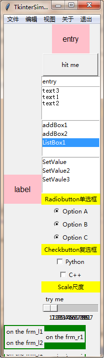
11.Frame框架
#Frame框架
frm = Frame(root,height=20, width=20, bg='green',border=2)
frm.place(x=0,y=620)
frm_l = Frame(frm)
frm_r = Frame(frm)
frm_l.pack(side='left')
frm_r.pack(side='right')

Label(frm_l, text='on the frm_l1').pack()
Label(frm_l, text='on the frm_l2').pack()
Label(frm_r, text='on the frm_r1').pack()
| width | 宽度 |
| bg,fg | 背景,前景 |
| border | 边框宽度 |
| font | 字体 |
| activebackgound | 鼠标划过时背景,同样有activeforeground,activeborderwidth,disabledforeground |
| cursor | 当子菜单分离原窗时,鼠标在子菜单栏上的形状cursor=”arrow””circle””clock””cross””dotbox”
“exchange””fleur””heart””heart””man””mouse” “pirate””plus”等图形 |
| height | 高度 |
| relief | 当子菜单分离原窗时的3D效果,relief=RAISED,SUNKEN,FLAT,RIDGE,SOLID,
GROOVE |
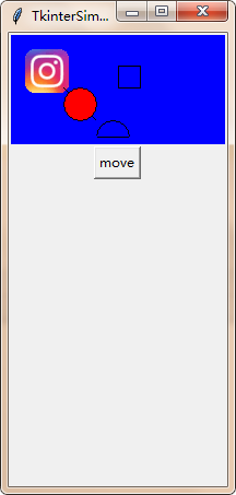
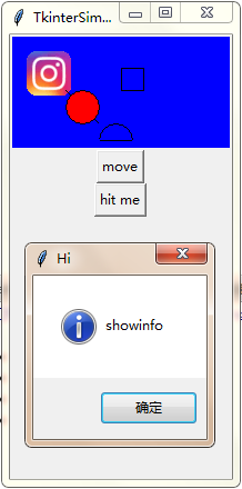
12.Canvas画布
#Canvas画布
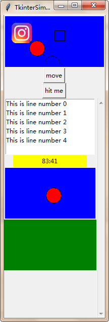
canvas = Canvas(root, bg='blue', height=100, width=200)#画布
image_file = PhotoImage(file='ins.gif')#获取图像
image = canvas.create_image(10, 10, anchor='nw', image=image_file)#把图像放到画布上
x0, y0, x1, y1= 50, 50, 80, 80
line = canvas.create_line(x0, y0, x1, y1)#画直线
oval = canvas.create_oval(x0, y0, x1, y1, fill='red')#画椭圆
arc = canvas.create_arc(x0+30, y0+30, x1+30, y1+30, start=0, extent=180)#画圆弧
rect = canvas.create_rectangle(100, 30, 100+20, 30+20)#画矩形
canvas.pack()
def moveit():
canvas.move(rect, 0, 2)#移动矩形
b = Button(root, text='move', command=moveit).pack()
|
master |
代表了父窗口 |
|
bg |
背景色,如bg=”red”, bg=”#FF56EF” |
|
fg |
前景色,如fg=”red”, fg=”#FF56EF” |
|
height |
设置显示高度、如果未设置此项,其大小以适应内容标签 |
|
relief |
指定外观装饰边界附近的标签,默认是平的,可以设置的参数:flat、groove、raised、ridge、solid、sunken |
|
width |
设置显示宽度,如果未设置此项,其大小以适应内容标签 |
|
state |
设置组件状态;正常(normal),激活(active),禁用(disabled) |
|
bd |
设置Button的边框大小;bd(bordwidth)缺省为1或2个像素 |
绘图函数:
|
create_arc |
绘制圆弧; |
|
create_bitmap |
绘制位图,支持XBM,bitmap= BitmapImage(file = filepath) |
|
create_image |
绘制图片,支持GIF(x,y,image,anchor); image= PhotoImage(file=”../xxx/xxx.gif”) ,目前仅支持gif格式 |
|
create_line |
绘制支线 |
|
create_oval; |
绘制椭圆; |
|
create_polygon |
绘制多边形(坐标依次罗列,不用加括号,还有参数,fill,outline); |
|
create_rectangle |
绘制矩形((a,b,c,d),值为左上角和右下角的坐标); |
|
create_text |
绘制文字(字体参数font,), 如font=(“Arial”, 8),font=(“Helvetica 16 bold italic”) |
|
create_window |
绘制窗口; |
|
delete |
删除绘制的图形; |
|
itemconfig |
修改图形属性,第一个参数为图形的ID,后边为想修改的参数; |
|
move |
移动图像 |
|
coords(ID) |
返回对象的位置的两个坐标(4个数字元组) |
13.Messagebox弹窗
#Messagebox弹窗
def hit_me():
    tk.messagebox.showinfo(title='Hi', message='showinfo') # return 'ok'
    tk.messagebox.showwarning(title='Hi', message='showwarning') # return 'ok'
    tk.messagebox.showerror(title='Hi', message='showerror') # return 'ok'
    print(tk.messagebox.askquestion(title='Hi', message='askquestion')) # return 'yes' , 'no'
    print(tk.messagebox.askyesno(title='Hi', message='skyesno')) # return True, False
    print(tk.messagebox.askretrycancel(title='Hi', message='askretrycancel')) # return True, False
    print(tk.messagebox.askokcancel(title='Hi', message='askokcancel')) # return True, False
    print(tk.messagebox.askyesnocancel(title="Hi", message="askyesnocancel")) # return, True, False, None
Button(root, text='hit me', command=hit_me).pack()
|
title |
指定对话框标题 |
|
icon |
指定消息框图标 |
|
message |
指定消息框所显示的消息 |
|
parent |
指定消息框的父组件 |
|
type |
类型 |
|
relief |
指定外观装饰边界附近的标签,默认是平的,可以设置的参数:flat、groove、raised、ridge、solid、sunken |
|
anchor |
设置Button文本在控件上的显示位置,可用值:n(north),s(south),w(west),e(east),和ne,nw,se,sw |
|
bd |
设置Button的边框大小;bd(bordwidth)缺省为1或2个像素 |
|
aspect |
控件的宽高比, 即 width/height , 以百分比形式表示. 默认为 150, 即 Message 控件宽度比其高度大 50%.
注意: 如果显式的指定了控件宽度, 则该属性将被忽略. |
|
cursor |
定义鼠标移动到 Message 上时的光标样式. 默认为系统标准样式. |
|
takefocus |
如果设置为 True, 控件将可以获取焦点. 默认为False. |
消息函数:
| showerror | 错误提示对话框 | showinfo | 信息提示对话框 |
| showwarning | 警告对话框 | askokcansel | 确认或取消;有返回值True、False |
| askquestion | 回答问题;有返回值yes、no | askretrycansel | 重试或取消;有返回值True、False |
| askyesno | 回答是非题;有返回值True、False | askyesnocancel | 是、否或取消,有返回值True、False、None |
14.Scrollbar滚动条
#Scrollbar滚动条
scrollbar = Scrollbar(root)
scrollbar.pack(side=RIGHT, fill=Y)
#将这些控件的yscrollcommand选项设置为scrollbar的set方法
mylist = Listbox(root, width=25,yscrollcommand=scrollbar.set)
for line in range(20):
mylist.insert(END, "This is line number " + str(line))

mylist.pack(side=LEFT, fill=BOTH)
#将scrollbar的command选项设置为这些控件的yview或xview方法
scrollbar.config(command=mylist.yview)

|
orient |
orient=tk.HORIZONTAL ,横向滚动,orient=tk.VERTICAL,纵向滚动 |
|
bg |
背景色,如bg=”red”, bg=”#FF56EF” |
|
relief |
指定外观装饰边界附近的标签,默认是平的,可以设置的参数:flat、groove、raised、ridge、solid、sunken |
|
width |
设置显示宽度,如果未设置此项,其大小以适应内容标签 |
|
bd |
设置Button的边框大小;bd(bordwidth)缺省为1或2个像素 |
15.Event事件绑定
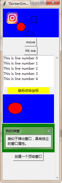
#Event事件绑定
def callback(event):
    global oval
    print("clicked at", event.x, event.y)

    l1.config(text=str(event.x)+':'+str(event.y))
    canvas.delete(oval)
    oval= canvas.create_oval(event.x, event.y, event.x+30, event.y+30, fill='red')#在鼠标位置创建图像

frame = Frame(root, width=200, height=100,bg='green')
l1 = Label(root, bg='yellow', width=20, text='鼠标点击坐标')
l1.pack()
canvas = Canvas(root, bg='blue', height=100, width=200)#画布
oval = canvas.create_oval(20, 30, 70, 70, fill='red')#画椭圆

canvas.bind("<Button-1>", callback)
canvas.pack()
frame.pack()
鼠标键盘事件
| <Button-1> | 鼠标左键按下,2表示中键,3表示右键; |
| <ButtonPress-1> | 同上 |
| <ButtonRelease-1> | 鼠标左键释放 |
| <B1-Motion> | 按住鼠标左键移动 |
| <Double-Button-1> | 双击左键 |
| <Enter> | 鼠标指针进入某一组件区域 |
| <Leave> | 鼠标指针离开某一组件区域 |
| <MouseWheel> | 滚动滚轮; |
| <KeyPress-A> | 按下A键,A可用其他键替代 |
| <Alt-KeyPress-A> | 同时按下alt和A;alt可用ctrl和shift替代 |
| <Double-KeyPress-A> | 快速按两下A |
| <Lock-KeyPress-A> | 大写状态下按A |
| <Control-V> | CTL 和V键被同时按下,V可以换成其它键位 |
窗口事件
| Activate | 当组件由不可用转为可用时触发; |
| Configure | 当组件大小改变时触发; |
| Deactivate | 当组件由可用转变为不可用时触发; |
| Destroy | 当组件被销毁时触发; |
| Expose | 当组件从被遮挡状态中暴露出来时触发; |
| Unmap | 当组件由显示状态变为隐藏状态时触发; |
| Map | 当组件由隐藏状态变为显示状态时触发; |
| FocusIn | 当组件获得焦点时触发; |
| FocusOut | 当组件失去焦点时触发; |
| Property | 当窗体的属性被删除或改变时触发; |
| Visibility | 当组件变为可视状态时触发; |
响应事件
| event | 对象def function(event)): |
| char | 按键字符,仅对键盘事件有效; |
| keycode | 按键名,仅对键盘事件有效; |
| keysym | 按键编码,仅对键盘事件有效; |
| num | 鼠标按键,仅对鼠标事件有效; |
| type | 所触发的事件类型; |
| widget | 引起事件的组件; |
| width,heigh | 组件改变后的大小,仅Configure有效; |
| x,y | 鼠标当前位置,相对于窗口; |
| x_root,y_root | 鼠标当前位置,相对于整个屏幕 |
16.Toplevel子窗口
#Toplevel子窗口
def create():
    top = Toplevel()
    #使用attributes()方法
    top.attributes('-alpha',1,"-toolwindow", 1,'-topmost',1)

top.title('我的弹窗')
msg = Message(top,text = '类似于弹出窗口,具有独立的窗口属性。',width = 150)
msg.pack()
Button(root,text = '创建一个顶级窗口',command = create).pack()
| -alpha | 1.0表示不透明,0.0表示完全透明 |
| -disabled | (Windows)禁用整个窗口(这时候你只能从任务管理器中关闭它) |
| -fullscreen | (Windows,Mac)如果设置为True,则全屏显示窗口 |
| -modified | (Mac)如果设置为True,该窗口被标记为改动过 |
| -titlepath | (Mac)设置窗口代理图标的路径 |
| -toolwindow | (Windows)如果设置为True,该窗口采用工具窗口的样式 |
| -topmost | (Windows,Mac)如果设置为True,该窗口将永远置顶 |
| 文件名称: | Tkinter控件快速引用总结代码.rar |
| 文件大小: | 4k |
| 更新日期: | 2018-7-29 |
| 文件版本: | V1.0 |
| 免责声明: | 本站大部分下载资源收集于网络,只做学习和交流使用,版权归原作者所有,若为付费资源,请在下载后24小时之内自觉删除,若作商业用途,请到原网站购买,由于未及时购买和付费发生的侵权行为,与本站无关。本站发布的内容若侵犯到您的权益,请联系本站删除,我们将及时处理! |
评论